Are you looking into creating KPI reports, but want to make sure you’re spending your time wisely?
Creating strategic marketing reports can be one of your company's best assets. But, if you don’t build it correctly, it can be one of your biggest time wasters.
That’s because having the right data is a crucial part in making better data-driven decisions (go figure).
So, today, we’re going to take a deep look into KPI reports. We’ll get clear on what a KPI report is and how they differ from KPI dashboards.
Then we’ll share the best way to build your own KPI reports and put everything on auto-pilot.
But before we can do any of that, we need to go back a bit further and define what we mean by “KPI.”
What Is a KPI?
KPI stands for key performance indicator. These are used by businesses of all sizes to track progress on their goals.
KPIs are measurable and quantifiable.
They act as a gauge of business success and are usually part of a larger strategic plan. Companies also use them to assess the performance of different teams and individual employees.
The problem is that KPIs are often confused with metrics, but they aren’t the same.
Metrics are simply things that you can measure. Some might be used as KPIs if they are relevant to your business strategy. But not every metric tells you anything about your progress towards your goals.
In other words, metrics are neutral pieces of data. KPIs are those same metrics but put in the context of a concrete goal.
It’s the goal that tells you if the metrics are “good” or “bad.”
Let’s take a familiar example from social media marketing. Your follower count is a number, so you can measure it. That makes it a metric. But the count on its own doesn’t indicate how well your social media efforts are working.
So, it’s no good as a KPI.
To track the effectiveness of your marketing, you want to measure your follower growth rate instead. This is how much your audience changes over time and is usually expressed as a percentage.
If one of your marketing team’s goals is to grow your social media audience, then your follower growth rate can tell you if you are achieving this aim.
Both follower count and follower growth rate are metrics. But only follower growth rate might be considered a KPI because it is the one that helps you to assess whether you are meeting your goals.
Put more simply, a KPI is always a metric, but a metric is not necessarily a KPI. The difference is in the goal being set for each metric.
If you want to know more about the difference between KPIs and metrics, I go over it in more depth in this post here.
Now that we’re clear on what a KPI is, let’s look at what we mean by “KPI report.”
What is a KPI Report?

The trouble with being a business in the 21st century is that there is an overwhelming amount of data coming your way at all times.
Back when everything had to be done manually by an actual human, businesses could only collect limited amounts of information. But then we all went digital.
And now you have data and metrics jumping out at you from every direction.
A lot of this information is useful. But plenty of it isn’t. The difficulty is picking out the relevant data and presenting it in a way that is easy to understand.
That is where your KPI report comes in.
It’s a regular snapshot of all the vital information that your company needs to monitor progress. It contains all your KPIs, maybe some interpretation… and nothing else.
That means you can focus on the important stuff, without being distracted by the vast amount of data available.
Which KPIs you include in your reports will depend on your niche and your company’s goals. Individual teams often set their own KPIs in addition to the wider organizational ones. You might therefore create one report for your own team and another for the organization as a whole.
Or you may create KPI reports for clients who, again, have a unique set of data they need tracked.
The best KPI reports use tables, charts, and graphs, so it is easy to see status and trends at a glance. They should also be consistent – reporting on the same KPIs and measuring them the same way each time.
This means that the information will be comparable to the previous KPI report, which lets you build a long-term picture of your progress.
Plus, KPI reports need to be created and shared at regular intervals.
How regularly depends on who is seeing it and what they need it for. Your board of directors may only need a monthly or even quarterly snapshot. Whereas individual teams might want more regular check-ins on their progress, perhaps weekly or even daily.
Compiling all these reports can be time-consuming. Fortunately, there are now tools that help you to automate most of the process, including MetricsWatch.
But more on that later. For now, let’s cover one more aspect of KPI reports: how do they differ from KPI dashboards?
KPI Reports vs. KPI Dashboards: What's the Difference?

KPIs can be shown in reports or on a dashboard. Although these seem similar at first glance, they work differently.
A report is a static snapshot of your KPIs at a point in time. Once created, the individual report isn’t generally updated, although the same report will likely be run at regular intervals.
KPI reports are generated and shared on an agreed schedule, such as once a month. They’ll be circulated to whoever needs to see them, often by email.
That means stakeholders don’t have to remember to check on their KPIs – the information they need will be sent straight to them.
A KPI dashboard, on the other hand, updates in real-time, or close to it. They are often accessed via the cloud. Because they display live data, they are a quick way of checking in on the pulse of your company’s current status at a glance.
Dashboards rely on people checking in regularly, so they work best in situations where you frequently need to have instantaneous access to data. They are less useful to people who only require the information occasionally.
Both dashboards and reports use visualizations, such as graphs, charts, and tables.
But reports are more likely to contain annotations, commentary, and interpretation. Both can display historical data, but this will usually be more limited in a dashboard, which is constantly updating.
There are advantages to both reports and dashboards when it comes to monitoring your KPIs. I’d caution against using dashboards on their own, however. That’s because if you’re using a 3rd-party dashboard, each person will need to have their own login, and you will also need to remind them to access it regularly.
That last part is the trickiest.
Most people have about a million tasks to juggle a day. Trying to get them to adopt a new habit (even one that just takes 5 minutes or so) can be near impossible.
Reports, on the other hand, just arrive in their inbox (depending on the tool you use). And even the email delivery can usually be automated, which is much less time-consuming to manage.
So, KPI reports and dashboards are both useful tools. But if you need to share information with clients, other departments, or senior management, reports are the way to go.
Which leads to the question: what’s the best way to build KPI reports?
The Best Way to Build KPI Reports
There are a few qualities you should look for in a tool that lets you build KPI reports. Here are the main ones:
- Ease of use
- Low learning curve
- Integrates with multiple platforms
- Cost-efficient
- Automated sharing
There are likely others depending on your specific needs, but these are generally the top 5 characteristics of a good KPI report builder.
And with that in mind, we’re confident that Metrics Watch is your best solution:
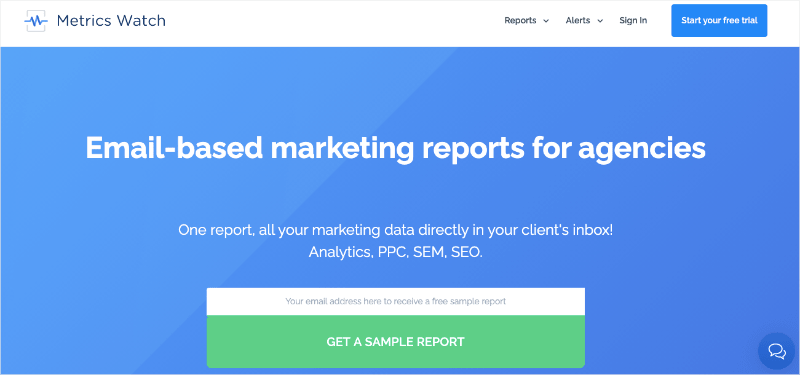
Metrics Watch is an all-in-one marketing report builder. It lets you pull data from your favorite marketing channels, such as:
- Google Analytics
- Google Search Console
- Facebook
- Instagram
- LinkedIn
- Mailchimp
- And more…
Then you can use the drag and drop builder to create daily, weekly, or monthly KPI reports.
Once built, you’ll be able to determine who needs to get this information. Then you can set the whole report sharing process on auto-pilot.
But why Metrics Watch over other reporting building tools?
The biggest reason is accessibility. See, most other tools share reports via PDF attachments or 3rd-party user dashboards (like we discussed above).
This adds friction to the report sharing process and is one of the reasons why many people find their users don’t read their reports with enough attention.
With Metrics Watch, though, you can send reports directly to your recipient’s inbox. This gives them the data they need in a format they already know.
That’s one of the reasons why the German stock trading company, onvista, chose Metrics Watch over 20+ other market report builders.
Want to see it in action for yourself? Click below to start your 100% risk-free Metrics Watch account (no credit card required):
Build & Share Automated Reports Today!And that’s it! We hope you found this post helpful. If you did, you might want to check out the following resources:
These posts will have everything you need to track the right KPIs and make smarter data-driven decisions for you and your clients.
