Are you trying to make a Google Sheets dashboard to track your marketing efforts, but don't know where to start?
Dashboards are great tools for helping marketers measure campaign results and see what's working with your strategy (and what isn't).
Generally, there are 2 ways to build a marketing dashboard:
- Manually
- Using an automated reporting tool
Automated reporting tools help you save time and money by pulling data automatically from multiple sources and letting you schedule reports to be sent directly to clients automatically.
But not everyone has the budget for a premium reporting tool.
That's why in this post, we'll share how to make a free Google Sheets dashboard in 5 easy steps that will give your colleagues or clients actionable insights to make important marketing decisions.
But before we start, let's take a quick look at what a Google Sheets dashboard is and why they matter.
What Is a Google Sheets Dashboard?
Dashboards are digital tools marketers use to track the performance of organic and paid campaigns.
By tracking key marketing metrics over time, dashboards can help to identify trends and opportunities, letting you optimize your strategy and make your budget go further.
Dashboards can combine data from multiple sources to create comprehensive, cross-channel marketing reports for tracking results from various types of campaigns, such as:
- Social media
- Search engine marketing/search engine optimization (SEM/SEO)
- Pay-per-click (PPC)
- And more...
But no matter what the purpose of your Google Sheet dashboard is, there are 5 things you can do to maximize the effectiveness of your reports.
Let's take a look at what those are now.
How To Create a Google Sheets Dashboard

Now that you know what a marketing dashboard is and why they're important, let's take a look at how you can build one for free using Google Sheets to track the results of your campaigns.
These 5 steps will help you to create meaningful reports that provide actionable insights for your clients and colleagues, helping them make better marketing decisions and increase their return on investment.
Step 1: Identify Your Goals
The first step in creating your Google Sheet dashboard is to set your objectives.
Your report should have a clear goal. This will help you choose the right key performance indicators (KPIs) to measure the success of your campaigns.
Some examples of dashboard objectives are:
- Increase the conversion rate of PPC campaigns
- Drive more website signups from social media traffic
- Improve keyword rankings of organic SEO content
Without a clear goal, your dashboard runs the risk of being difficult to read and understand.
It’s common to have multiple marketing goals. But rather than trying to cram all your data onto one report, you should split them up. Having a dedicated dashboard for each objective ensures that data is easier to read, which increases the reader's ability to take appropriate action and reach their business goals faster.
Once you’ve identified your objective, it’s time to choose the KPIs for your dashboard.
Step 2: Choose Your KPIs
The second step in building your Google Sheet dashboard is identifying your KPIs.
Key performance indicators are metrics that you will use to gauge the success or failure of a campaign.
We recommend limiting your KPIs.
The biggest problems we see marketers face when building dashboards are having:
- Too much data: making reports hard to understand
- Too many vanity metrics: data that looks impressive, but isn’t helping you achieve your goals
A good rule of thumb is that if a metric isn’t being used to inform a decision, then it shouldn’t be in your report.
By including only metrics that you plan to take action on, you increase the effectiveness of your dashboard. It also makes your report quicker and easier to read, saving your team and clients time and making it easy to incorporate reporting into their busy schedules.
Remember: a metric can be a useful KPI for one person, but totally irrelevant to another.
That’s why we recommend creating tailored reports for each recipient (if appropriate).
If you’re building dashboard reports manually with Google Sheets, this can be very time-consuming.
In this case, you might benefit from using a dedicated reporting tool that pulls data automatically from data sources to save time and ensure that data is reliable and up to date.
Once you’ve chosen which KPIs to track, you need to make sure that your data is as accurate as possible.
Step 3: Set Up Tracking Links
Google Analytics generally does a good job when it comes to segmenting your website data, but with Apple’s recent iOS updates letting users opt out of app tracking, this becomes harder.
Your dashboard is only effective if the data is accurate.
So if you plan to include data from Google Analytics in your Google Sheets dashboards - such as the number of conversions from Instagram traffic - then you should be using tracking links.
The easiest way to do this is using UTM parameters.
UTM parameters are snippets of code attached to a URL that helps Google Analytics to track your campaign traffic more accurately. If you know where your conversions are coming from, then you can allocate more of your budget to those channels or campaigns to reach your business goals faster.
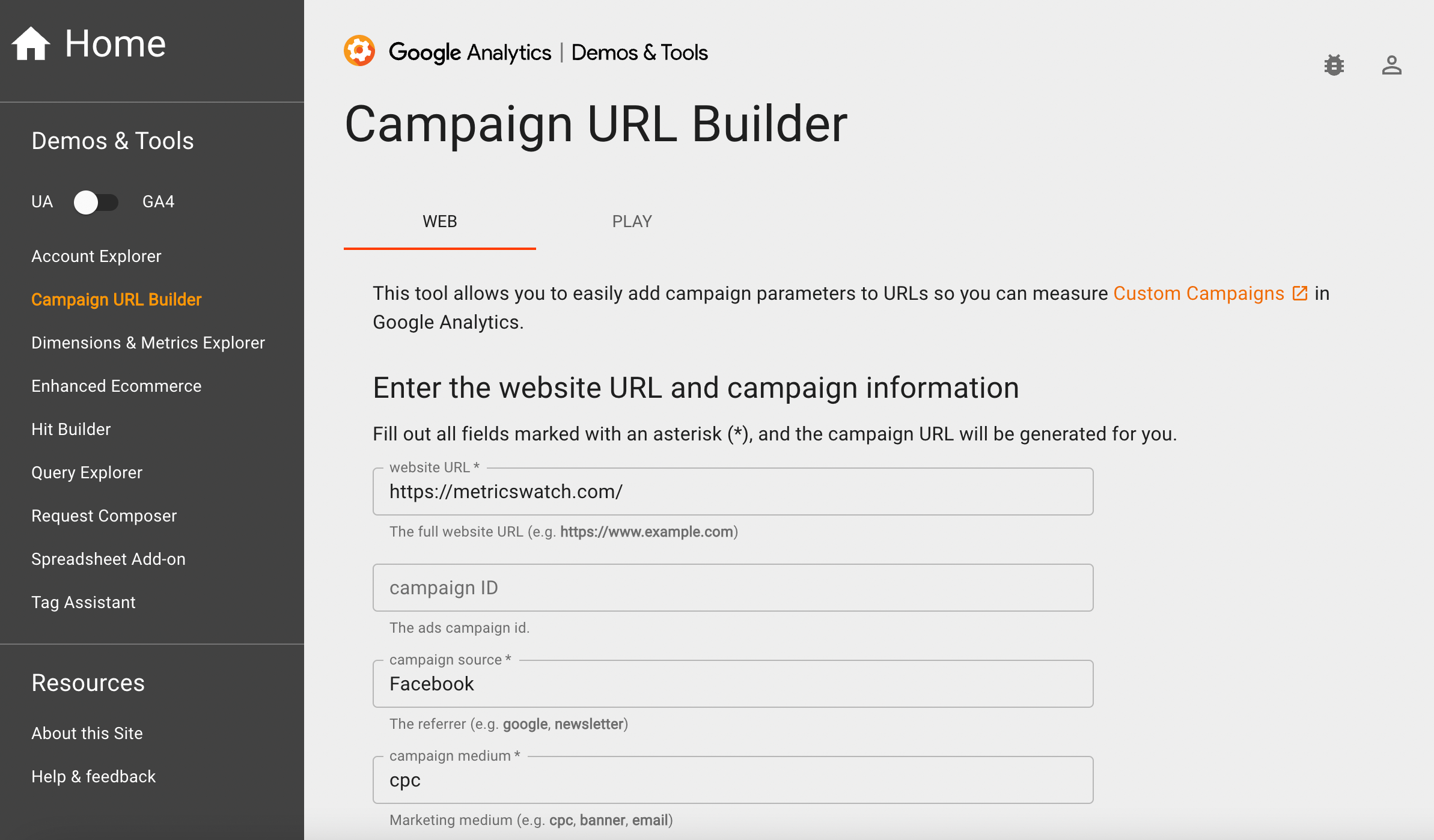
Here is an example of a URL with a UTM parameter:
https://metricswatch.com/?utm_campaign=Campaign_URL_Builder&utm_medium=social&utm_source=facebook
Google's Campaign URL Builder lets you create UTM tracking links for free:
For more information, you can check out our full guide to learn what UTMs are and how to use them the right way.
Now that we’ve made sure that your data is accurate, let's take a look at how to best present it to the person viewing your dashboard.
Step 4: Visualize Your Data
The next step is to make your data easy to read, allowing the reader to quickly understand what’s going on and take action.
Charts and graphs can quickly turn a boring list of numbers into a visually appealing dashboard. It also gives data more context, making it easier to measure performance at a glance and spot trends.
When visualizing data in Google Sheets, you have the option of inserting a chart or adding a sparkline - a small chart inside a single cell that displays data trends over time.
4.a. How To Create a Chart in Google Sheets
Creating a chart in Google Sheets is simple with a variety of options for visualizing your data.
Step 1: Select the cells you want to include in your graph. You’ll also want to include a column of labels and make sure your values also have a title.
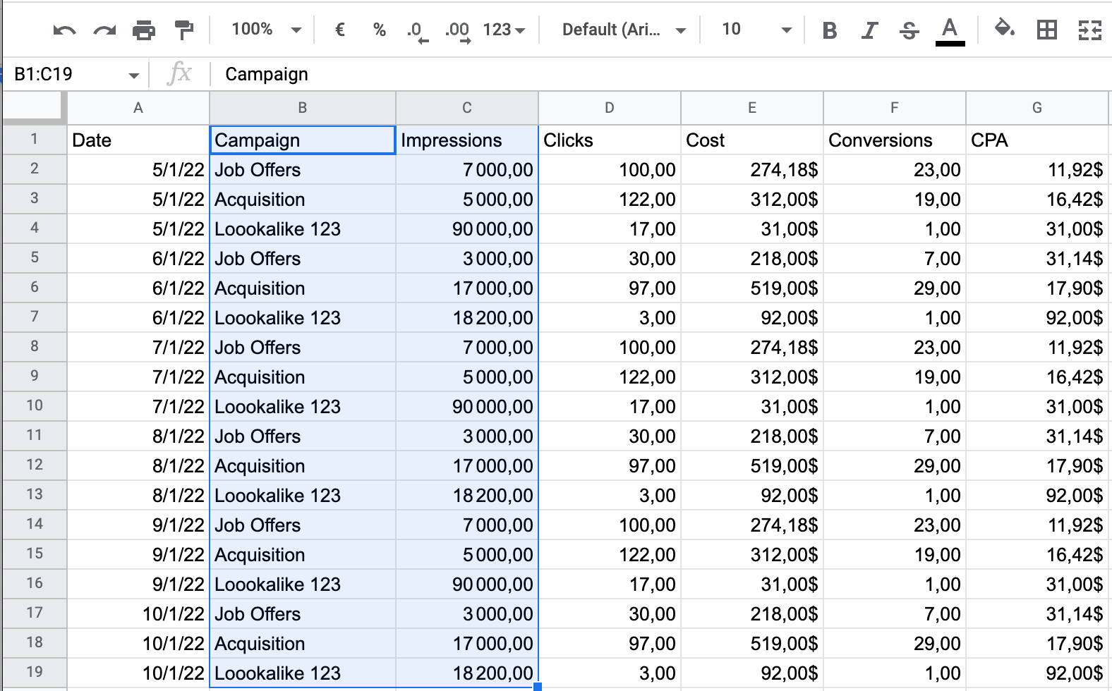
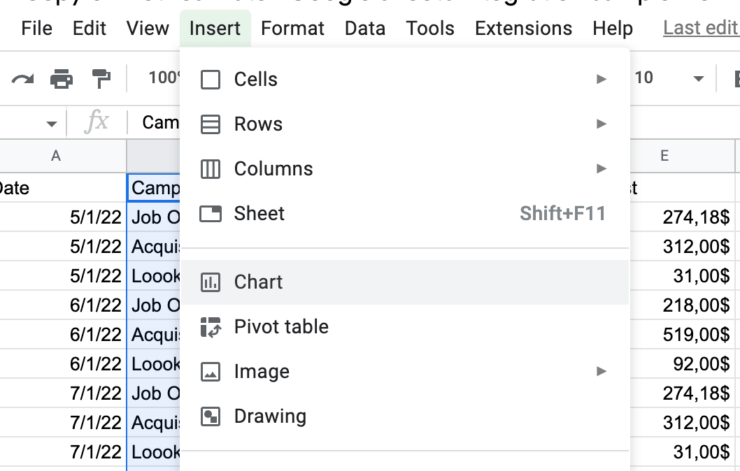
Step 2: Click Insert and select Chart from the drop-down menu.
Step 3: This opens the Chart Editor window.
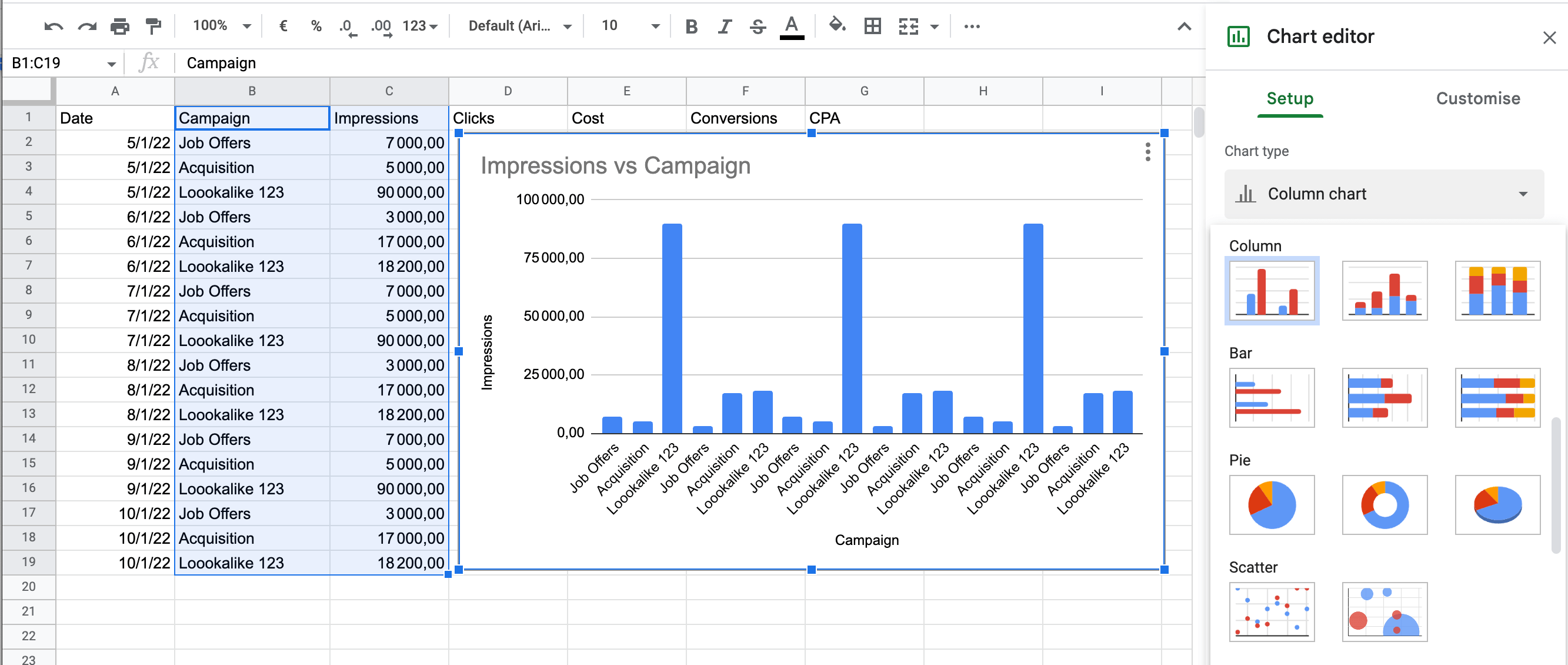
In the Setup tab, click the Chart Type drop-down menu to choose how you want to display your data.
Choose from line charts, area charts, pie charts, scatter charts, and more.
Step 4: Navigate to the Customization tab for more formatting and style options.\
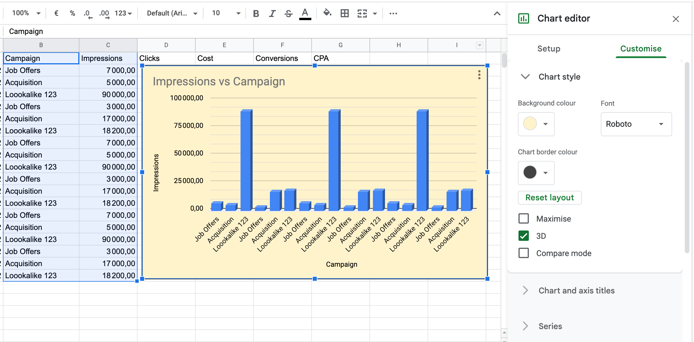
Step 5: Move your chart to its desired position by clicking and dragging.
If you want to go back and edit your chart, click the 3 vertical dots in the top right-hand corner of the chart. This menu also has options to download, duplicate, delete your chart, and more:\
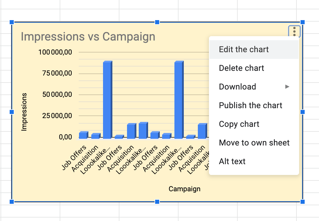
To move your chart to its own sheet in the document, select Move To Own Sheet.
4.b. How To Create a Sparkline in Google Sheets
Making a sparkline chart is easy and can be done in 2 simple steps:
Step 1: Select the cell where you want the sparkline to go.
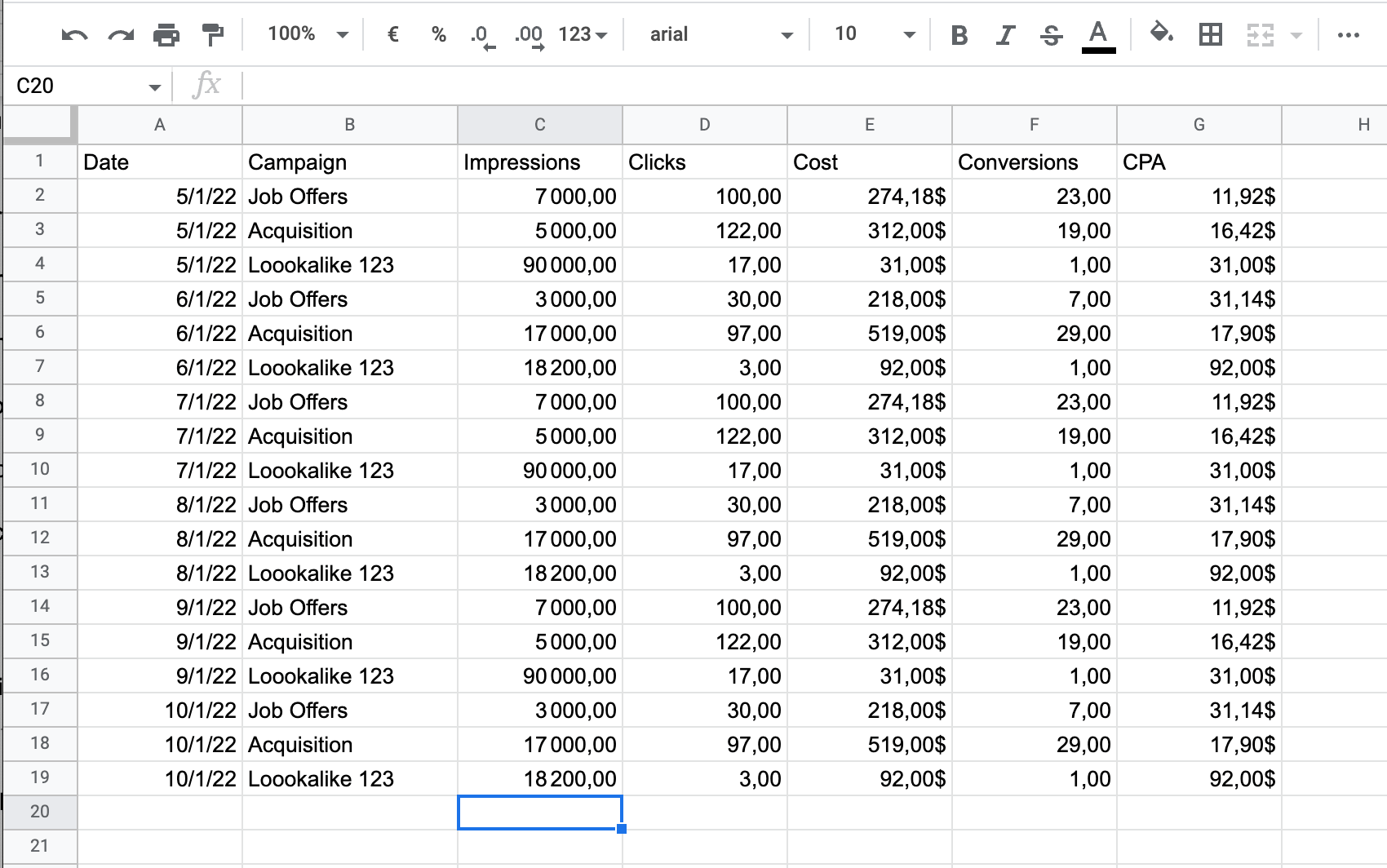
Step 2: Enter the formula =SPARKLINE and set the cell range in brackets, for example:
=SPARKLINE (C2:C19)
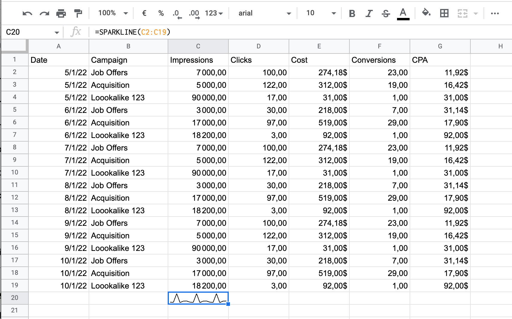
And that’s it!
If you want to customize your sparkline chart further then check out Google’s support page to learn how to add bars, change color, and more.
As you can see, it doesn’t take long to visualize your data, but it has a huge impact.
When reports are easier to read, your team or clients will actually look forward to receiving them. This makes it much more likely that they will understand and act on the data, making your reports more valuable overall.
Now that you know how to visualize your data, let’s move on to the final step so that you can spend less time creating reports and more time marketing.
Step 5: Automate Your Reporting
The final step in creating your Google Sheet dashboard is to automate your reporting.
This helps you save time and ensure that data is accurate.
When building a Google Sheet dashboard manually, the best way to do this is to set up a shareable link for your client or team to view their dashboard on demand. However, the problem with this is that you are relying on them to remember to go and look at their data.
You can get around this by sending them an email each day, week, or month with the link and a reminder to view their dashboard, but this takes up time that you could be using to do more important tasks.
That's why we recommend using an automated reporting tool.
This insures that reports are delivered on schedule so that your colleagues or clients have the data they need when it matters most.
It also eliminates the risk of human error.
Since data is pulled from sources automatically, you don't have to worry about copy-paste errors (which can be disastrous if they lead to bad business decisions being made).
And for that, there's no better tool than Metrics Watch:
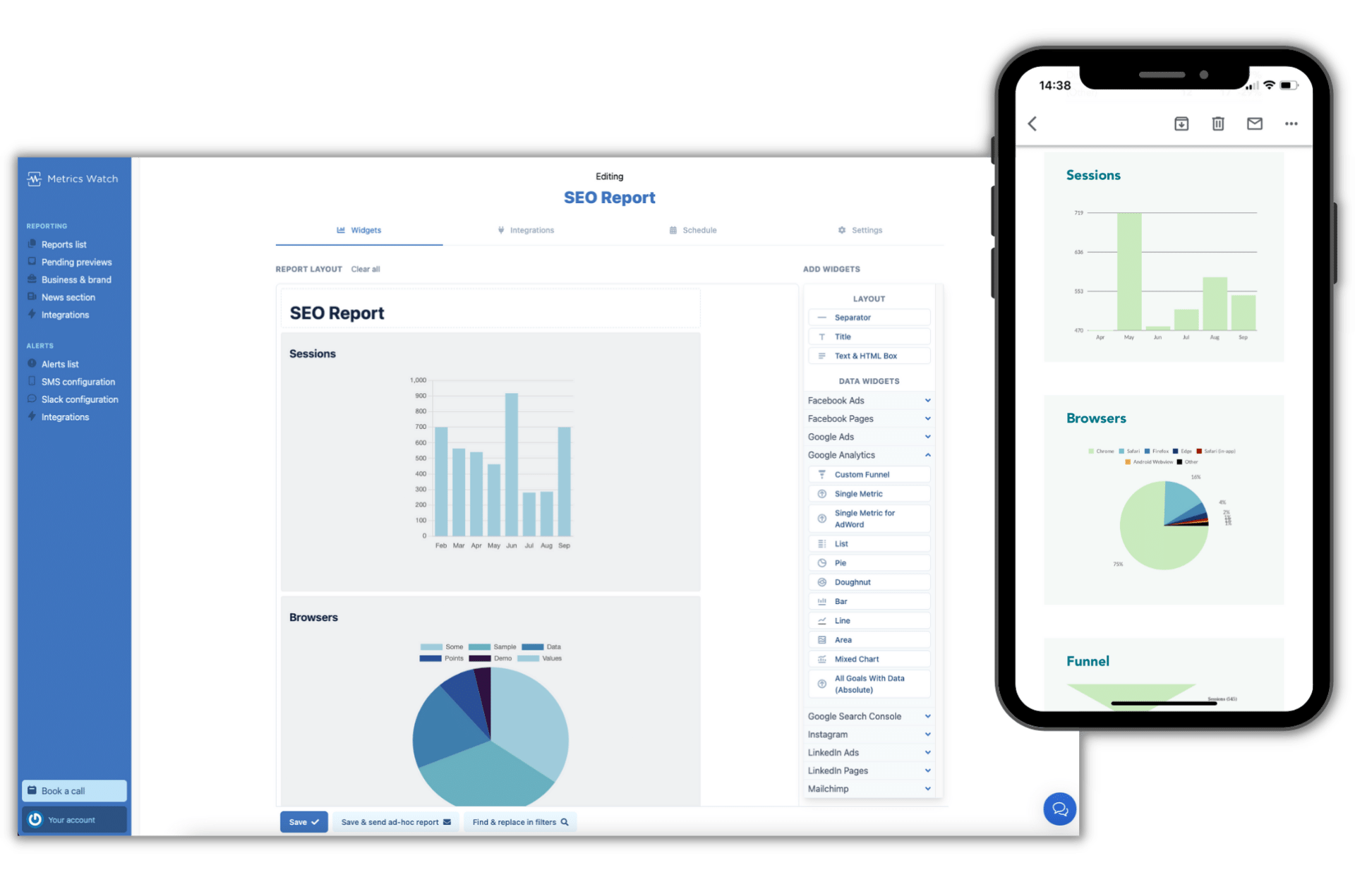
Metrics Watch lets you combine data from multiple marketing channels to create comprehensive, cross-channel marketing reports, including:
- Google Sheets
- Google Analytics
- Google Search Console
- Facebook
- Instagram
- Mailchimp
- And more...
Build professional marketing reports fast using a code-less drag & drop editor, or choose from a selection of ready-made templates to get going fast.
Bring your data to life with charts and graphs that add context, making it easy to track your progress and identify trends.
Reports can be scheduled to be delivered by email daily, weekly, or monthly to meet your needs.
But the best thing about Metrics Watch is the way that data is shared...
Reports are displayed in the body of the email itself, removing the need for pesky PDF attachments or links to third-party dashboards.
This lets you view important marketing data at any time, on any device, from the comfort of your inbox.
Want to see it for yourself?
Enter your email below to receive a free sample report direct to your inbox, just as your team or clients would receive it:
Or you can click here to start your 100% risk-free trial of Metrics Watch and dive right in - no credit card required!
Start Your Free Trial Today!And that's it!
This has been our guide on how to make a Google Sheets dashboard in 5 steps. If you enjoyed this post, then be sure to check out these other articles:
These additional resources have even more tips for building more effective reports to boost ROI and reach your goals faster.