Are you looking for the most accurate Google Analytics UX metrics that will help you boost the user experience across your site?
The way your new leads feel when they're navigating your website is critical to generating more customers.
If your site's traffic enjoys working with your site, they're much more likely to come back. If they don't, though, then you're looking at tons of lost opportunities for sales and marketing.
That's why, in today's post, we're going to share 5 Google Analytics UX metrics that you can start using to improve the customer journey.
But first, let's get clear on why you should work to improve the user experience (UX) on your site at all.
How User Experience Affects Your Marketing
Your audience's user experience (UX) is absolutely vital to getting as many new leads for your business as possible,
There are so many benefits to improving your site's UX for new visitors. Here are just a few:
1) Boost Referral Marketing
If you're a business owner who needs more leads for their company, then the best way to do that is by having an attractive site that people want to share with others.
Your audience will be much more likely to refer your website if they enjoyed navigating it and had a good experience overall.
2) Improve Conversion Rate
A well-designed website is also much more likely to convert customers into leads.
It's not enough for your site just to be navigable, it needs to provide a message that resonates with your audience and makes them want to buy what you're selling.
3) Increase Your Brand's Reputation
Users also tend to be more loyal and enthusiastic about companies that offer a great user experience.
When you build your site with the customer in mind, then they're much more likely to come back for future business and recommend it to others.
These are just a few of the main advantages of improving UX across your site, though there are many others.
But this begs the question: how do you measure UX in the first place?
Let's turn our attention to 5 Google Analytics UX metrics you can start tracking today.
5 Google Analytics UX Metrics
1) Time on Page

This measures how long users spend on a page before they leave and what pages they interacted with.
The average visitor spends about 2-3 minutes on an online store, for example. If someone has left your website before spending only one minute, then it's likely that they didn't enjoy their experience.
You want to make sure your audience is there long enough for them to find what they're looking for and engage with the content.
We recommend that you aim to keep people on your site at least a few minutes, if not more than five. The longer time spent on your site means higher likelihood of conversion-related goals being achieved
How do you increase time on page?
There are always things that you can do to increase time on page, such as rewriting content for better clarity and removing excessive navigational elements.
Another way is by adding more personalized messages based on what the user has interacted with previously or through additional pages they've visited.
It's also important to pay attention to additions like pop-ups that interrupt the user experience.
The last thing you want is for your potential customers to feel like they're being spammed with ads and notifications, so make sure there's a balance.
2) Bounce Rate
Bounce rates measures how many people leave your page within a few seconds of landing on it.
In other words, these are people who quickly viewed the content, decided it wasn't what they were looking for, and hit the back button.
The bounce rate should ideally be low, because it signals that visitors are finding what they're looking for on their first visit or don't want to stay any longer.
It's important not to confuse this metric with the Pageviews metric, which measures how many visits per day your site gets.
If a high bounce rate is accompanied by an increase in pageviews (meaning that people are visiting more pages but getting bored quickly), then it's time to rethink your content strategy and layout.
How do you lower bounce rates?
The best way to lower bounce rates is by using personalized messages, like pop-ups that offer targeted offers or suggestions.
This will make it more likely for your visitors to stay on the page and get engaged with what you're offering.
It's also important not to overwhelm them with too many options at once – this can be a turn-off. There's nothing wrong with having a lot of options, but it can be overwhelming for someone just starting out on your site who may not know what they're looking for
3) Behavior Flow

Behavior flows highlight where people enter on the page, what paths they take as they navigate to other pages, and which content most interests them throughout their session.
The goal here is to improve UX by understanding what the user is looking for and what they like to read.
For example, if a visitor lands on your contact page but doesn't look at anything else before leaving, then it's possible that there was something off-putting about the content or design of the page.
By looking at the behavior flow (as a whole), you'll get a better idea of where the customer journey was going smoothly and where there are improvements to be made.
How do you improve behavior flow?
The best way to improve behavior flow is by making sure that every page on your site has a clear and concise purpose.
It could also be that you need to adjust the design of your navigation or add more personalized messages.
You should also monitor how visitors move and engage with content throughout their visit – this will give you a good idea of what they're looking for, where they are getting bored, and when they leave.
If someone is bouncing at six seconds (meaning they never clicked on anything), then you know there's something wrong with the design.
4) Pageviews
Pageviews are found in the Behavior section of Google Analytics and they measure how many times your site was viewed.
These numbers can be really high if people keep browsing around, but it's important to remember that each pageview only counts as one visit (so there is no overlap).
This metric tells you about overall engagement on your site, but it doesn't tell you how engaged the visitor is with a particular page.
For example, you can have really high pageviews but a low conversion rate. That means while people are generally visiting your website, there's something preventing them from taking action.
This will let you look at which pages have the most views (and lowest conversion rates), so you can boost the UX on that page and, hopefully, drive more sales.
How do you increase total pageviews?
The best way to get people to browse around more on your website is by not overwhelming them with too many options at once and providing clear navigation tools that will guide them to the content they're most interested in.
You can also try to generate more traffic on your site by doing things like updating content regularly and adding new products. This will get people engaged with a lot of different pages instead of one or two main ones, which is great for the UX.
5) Conversions

This could be anything like filling out a form, making a purchase, downloading something, or clicking on an ad.
The point of this metric is to identify what content (or pages) brings people closer to taking action.
It also tells you if the user got stuck along the way and couldn't figure out how to complete their goal, which could be a UX issue or just poor design.
So while pageviews were only one half of the equation when looking for ways to improve UX, conversions are the other half.
If your pageviews are high but conversions are low, your UX might need some work.
If your conversions are high but pageviews are low, then you know that your UX is probably fine, but you need to work on new lead generation strategies.
Either way, you have helpful data to help you move forward!
How do you increase conversions?
The best way to increase conversions is by improving the UX and clarity of your page.
This means making sure that the call-to-action is clear, there are no distractions on the page, and a user can easily find what they're looking for.
The BEST Way to Track These Metrics
One of the biggest problems marketers face isn't knowing what they "should" track. Instead, it's actually taking the time to track it.
Usually this is done through sporadic marketing reports.
The problem is that when you compile these reports by hand, they can be tedious and time-consuming, not to mention prone to human error.
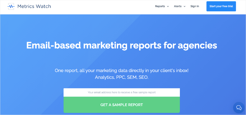
That's why I always recommend working with a report building tool like Metrics Watch:
Metrics Watch is a report building tool that lets you automatically pull data from Google Analytics.
But you can also combine KPIs from other marketing reports, too. That would be from sources like:
- Google Search Console
- Google Ads
- Facebook (paid and organic)
- Instagram (paid and organic)
- LinkedIn( paid and organic)
- And more...
This gives you the freedom to make comprehensive marketing reports and design them however they makes sense to YOU.
That's because Metrics Watch has a codeless drag and drop visual builder. That means you don't need to know any good or even have technical skills to get started.
Once you've connected your marketing channels, all you need to do is drag and drop the metrics you want where they need to be.
Then you can share this data on a daily, weekly, or monthly basis (depending on when your team or clients want the reports).
But the best part is that sharing these reports is incredibly easy. That's because there's ZERO friction involved.
Unlike other marketing tools, Metrics Watch sends your Google Analytics UX metrics directly to your recipient's inbox. No PDFs to organize and no managing user login roles for 3rd-party dashboards.
Instead, you can send the data people need in a format they already know.
Want to see it in action for yourself? Click below to start your 100% risk-free Metrics Watch account today (no credit card required):
Start Your Risk Free Metrics Watch Trial Today!And that's all for now! I hope you enjoyed this post. If you did, feel free to check out the following resources:
These articles will have even more information you can use to improve your Google Analytics tracking to build a stronger marketing strategy.
