Over the past year, I’ve been building up Metrics Watch on both the product and the marketing side. It’s been a crazy year (as it’s been for all of us, I’m sure), but I’m overall happy with the progress we’ve made.
So as we’re preparing to enter the last quarter of the year, I wanted to give you a glimpse of what’s been going on behind the scenes.
I’ll quickly walk you through 9 updates we’ve made over the course of 2021 and give you a peek behind the curtain at what’s coming up.
Let’s dive into these changes!
Product Updates for 2021
1) Redesign in February
First and foremost, let’s talk about Metric Watch’s user interface (UI).
From the start, our report-building dashboard has always been functional–though it hasn’t always been attractive. I imagine this is the way most SaaS products come about, particularly when working iteratively.
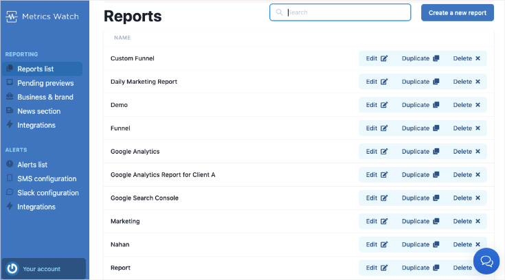
But in February 2021, we went ahead and overhauled the design to be more user-friendly and easier to navigate.
Plus, and I hate to put it so bluntly, it just looks AND feels better:

While there are improvements to be made down the road, I’m happy with the update and encourage you to check it out. You can click the link below for a 14-day no-risk trial (no credit card required):
Build Automated Marketing Reports Today!As always, I’m open to any constructive feedback as I strive to make Metrics Watch better each year.
2) Added ChartJS to Bars and Graphs
Chart.js is an open-source platform for designers and developers. It makes your visual charts/graphs more flexible, more accurate, and more aesthetically pleasing.
In other words, it’s a blanket update to all the visual charts and graphs in Metrics Watch reports. It also expanded the types of visualizations I could add, such as:
- Line charts
- Area charts
- Donut charts
- Mixed charts
This may seem like a small or “luxury” update, but visual representations of your data are really important.
That’s because creating the report is only half the battle. The other half is making sure people on the other end are using the data you give them.
By making more detailed and accurate visual representations, you allow people to digest that data more quickly (not to mention more easily).
As a result, people are more likely to open your reports, take in the information, and build stronger marketing strategies.
Whew… OK.
Like I said at the start of the post, it’s been a BUSY year.
Part of the reason is that I’m currently flying solo on the development side of things. I’ve had a bit of help with marketing over the last few months, and I’m excited to bring on a full-time marketer in a few weeks.
Plus, I’ll be adding additional help on the dev side before too long. This means we’ll be making even MORE updates to Metrics Watch soon.
Let’s take a look at 3 changes already planned in the not-so-distant future.
3) Ad Platform Integrations Now Have Filters
This is an update that was specifically for agencies running pay-per-click (PPC) ads via Google. The idea is that you can now share results by filtering out the Ad Groups you’re agency is responsible for.
This gives easier access to more accurate data. You can visually show how much your agency is producing results compared to ads that were made by your client (or a competitor).
The goal is to give customers a concrete value to show your agency’s worth.
This is a GREAT update if you’re an agency that gets GREAT results (but a bad update if you’re an agency that gets bad results 🤷♂️ ).
This is also available for our Facebook Ads and LinkedIn Ads integration.
4) Visual Ads and Graphs for LinkedIn and Google Ads
They say a picture is worth a thousand words. That’s great, but when it comes to understanding how well your ads are performing, you only need about 5 words:
“Are these ads making money?”
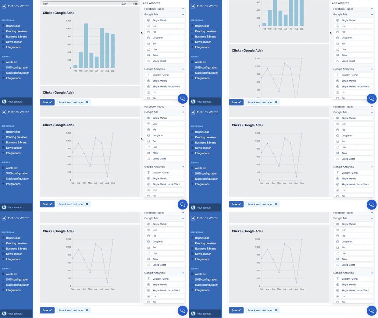
If not, it’s back to the drawing board. That’s why we added visual graphs for both LinkedIn and Google Ads:

That way, whoever is reading your marketing reports can understand the impact of these ads at a glance. And if things don’t seem to be working, they can take a deeper dive into the non-visual data (but hopefully it won’t come to that 😉 ).
5) Support for a 3rd Metric Column in Lists
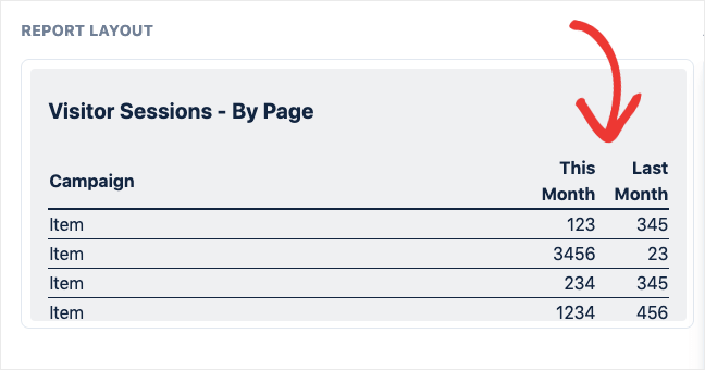
Before April 2021, the visual lists in Metrics Watch reports could have up to 2 columns. I ended up adding a 3rd column to give users deeper comparisons for their KPIs in a single spot.
There are a few ways that this helps the user, mostly because it allows you to add more data in one widget. This makes life a little easier for the people who are reading/analyzing your report’s KPIs.
But really, it’s just a better use of space. If I wanted to track 6 KPIs in a list from Google Analytics, for example, I can now use 2 widgets instead of 3.
And, for lots of my current customers, 3 KPIs per integration is more than enough. That means this change was both good for the user and also a more efficient use of your report’s space.
6) Add Daily Reports to Monthly Reports
This feature is perfect for getting a higher-overview look at what’s been working in your marketing plan.
This allows you to add your daily progress from the start of the month to the day you’re currently on. Then, you can compare this with the same timeframe as the previous month:

So, for example, you could create a report that gives your daily progress on pre-chosen KPIs for September 1st - 23rd (assuming it was currently September 23rd).
Then you could pull up the data to compare these KPIs against the same time period in the previous month (August 1 - August 23rd).
This gives you a comprehensive understanding of where your marketing campaigns stand, where you should double down on your efforts, and what needs to get tweaked. And it will show you which areas of your marketing are gaining traction.
In the end, this leads to more impactful marketing campaigns which translate into more sales for your business.
7) Funnel Widget Is Out of Beta
I had been working on our funnel widget for a while. Its function is to visually display your sales/marketing funnels in an easily digestible way.
Like all roll-outs, there were a few bugs that needed fixing before I could present it to new customers. Now, I’m happy to announce that this widget has been battle-tested and is working the way it should.
You can build custom visual funnels for your marketing reports and share them with confidence. 😄
8) Slack Updates for Alerts
Back in March, we implemented a Slack integration for our Google Analytics alerts product. This was a crucial change, especially as more teams were adopting full-time remote work.
Slack’s presence and popularity were amplified by the pandemic, which gave us a great opportunity for teams to catch problems faster. That’s because we were able to send real-time Google Analytics alerts directly to Slack channels.
Imagine having a bug with your site’s checkout flow at 3:00 am on some Tuesday morning.
Now the alert will go to your Slack channel so whoever is currently working can address the issue. That means no more waking up from a notification at 3:00 am but also resting assured that any bugs can get fixed quickly.
Upcoming Changes to Metrics Watch
1) Google Sheets Integration
This update has been a long time coming. But I’ve always wanted to add an integration for Google Sheets.
Basically, it would allow you to sync ANY data from a Google Sheet with your Metrics Watch reports.
Some popular use cases for this have been:
- Custom CRMs for small businesses that export to Google Sheets (it’s a popular situation with car dealerships)
- SEO data
- Stripe revenue
- Fitness tracking (like with a FitBit)
- And so much more…
Data can be drawn from Zapier pulling from thousands of sources. This data can be put into a Google Sheet and automatically synced with Metrics Watch.
In other words, you can LITERALLY track ANYTHING.
For example, I’ll be tracking the number of visitors per hour we get this Halloween for fun.
I could then take this data and add it to my analytics report.
This probably isn’t something most of my customers are going to do, but they’ll have thousands of other options at their disposal.
At any rate, this is one of my MAJOR priorities moving forward. Adding Google Sheets to the Metrics Watch ecosystem will open up unlimited tracking possibilities for our customers, so it’s definitely worth our attention.
2) New Report Templates Are Coming
One of the things I know would help customers out are pre-made report templates. That would make Metrics Watch much more close to a “plug n’ play” tool that I’ve always wanted it to be.
The goal is simple: to help niche businesses create professional marketing reports in as few clicks as possible.
We’ll be refining templates for things like:
- SEO
- Paid Ads
- Email Marketing
- Social Media
- And much more…
Right now, I’m putting this on the same priority level as our Google Sheets integration. We’re currently hiring a new developer (and onboarding a full-time marketer), so we should be seeing those rollouts before too long.
3) Widget-Level Account Selector
Right now, Metrics Watch is mostly set up to function like so: one report is built for one client or company.
But if a business had multiple Google Analytics (GA) accounts, you would need to create one report for each of those accounts.
This is less practical for businesses that have a combination of websites or apps under different GA properties.
Imagine a company like Metrics Watch that has a website for marketing purposes but a separate app as the product. I’d need data from both the site and the app but, ideally, it would be in the same analytics report.
Another example would be larger companies that have a website for marketing but a separate eCommerce store.
Again, the data is analyzed separately, but it’s all working for the growth of the same business. Hence, why you’d want all those KPIs in ONE comprehensive report.
We’re currently making it possible to select which Google Analytics account you want to track directly in your reporting widget.
This means you’ll be able to add data from multiple GA accounts for the same marketing report.
That gives you a better understanding of how all the moving pieces are working together to grow your company.
4) Adding a Changelog
Finally, this one is for the die-hard fans. I’ll be adding and updating a formal changelog so clients and potential customers can keep track of the updates we’re making.
This will be especially important after I hire a developer (starting in October 2021), as we’ll have more bandwidth to make significant changes that have a larger impact on our customers.
Right now, our designer is working on building out the page to make the updates as clear and easy to read as possible.
We’re still making constant updates and changes to the product, but holding off on publishing the changelog until a design gets finalized.
But you might wonder, “Why bother with a changelog at all?”
While this isn’t something that will affect Metrics Watch as a product, it’s something I’ve wanted to have for a long time now. I think it’s good when companies can be transparent about the issues they’ve had and the approach they’ve taken to fix them.
An active changelog seems like the most efficient way to accomplish both.
Finally, as I wrap up, I want to say a special thank you to both Metrics Watch customers AND those supporting from afar. I know the product isn’t right for every business model, so I appreciate those people who still read the blog posts, follow us on social media, and give general encouragement to my private inbox.
I’ll continue to bring new changes to Metrics Watch, and I’m thrilled to see what updates are made in 2022 as we bring fresh blood and perspective to the team!